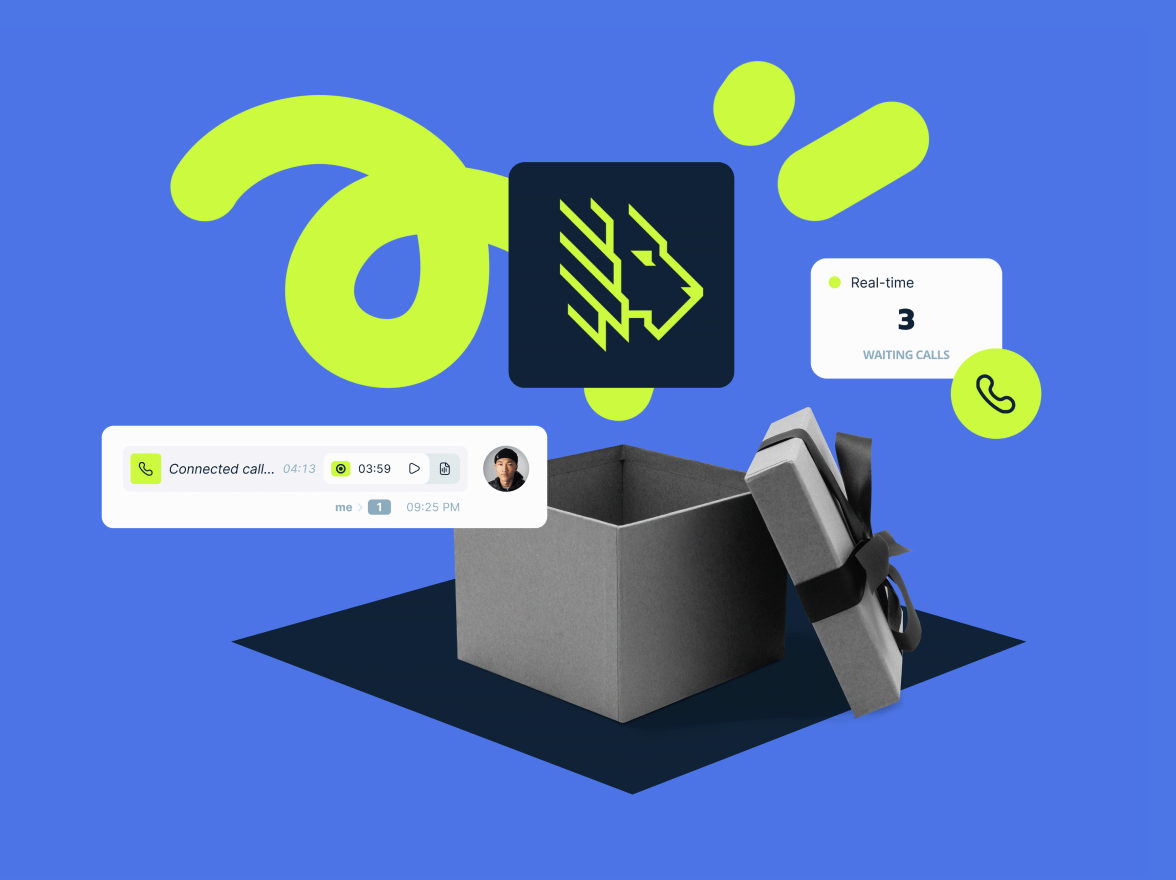
A few months into a year that has gotten off to a crazy start for all of us, MightyCall is celebrating an optimistic and extremely reassuring milestone: the launch of our vibrant new logo. We’re proud of our “updated” lion and hope you’ll love it as much as we do!
But what we’re even more excited about– and what our revamped MightyCall lion stands for — is an important milestone in our journey as a team. A journey of evolving our product, both inside and out, to serve each one of you in the best possible way.
Our new logo isn’t a superficial move. It’s a reflection of the daily evolution that usually goes on behind the scenes, and which accounts for the rich experience behind us and many new heights ahead. It’s these new heights that the MightyCall lion can’t wait to conquer with lightning speed, optimism, and more energy than ever before!
In this behind the scenes special, we’d love you to meet some of the people who breathe life into our mighty service each day. Discover the story behind MightyCall’s new symbol, our goals for the future, and … Hubert the real African lion, our roaring inspiration!
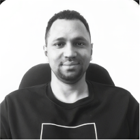
Leading renewal inside and out: Dmitri Lepikhov, CEO, MightyCall
As CEO of a dynamically developing and vibrant company, Dmitri Lepikhov craved a symbol that projects that message from first sight. Replacing the beloved lion as the company’s logo has never been an option, but Dmitri felt it was time to refresh the classic look with the innovative values we’ve been honing.

“Both our team and clients love what the lion stands for — might and speed. But we also wanted our logo to be instantly recognizable, mobile-oriented, and to better represent a product which is all about powerful technology combined with a service that’s extremely user-friendly.”
Commenting on the processes that sparked the changes, Dmitri notes that “surface” changes in design are just the visible aspects of the growth processes constantly going on within MightyCall.
“When the company pays attention to all its processes — technological as well as external — it’s a reflection of growth and development. For me, the renewal of our logo reflects renewal within the company, a new stage of development of our product, and the maturity of our business processes.”
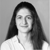
The story of Hubert the Lion: Anna Miranchuk, Product Manager, MightyCall
Anna Miranchuk is one of those people who’s been on our team so long, she can trace a large part of the company history at a moment’s notice. So it comes as no surprise that it was Anna who filled us in on a fascinating fact about the MightyCall lion.

“Most people would be surprised to know that MightyCall’s symbol was inspired by a real-life African lion. In 2014, one of our employees “adopted” an African lion named Hubert, who lived in Seattle’s Woodland Park Zoo before moving to L.A. Zoo in 2014. So the lion isn’t just a part of our branding — it’s driven our company spirit all these years!”
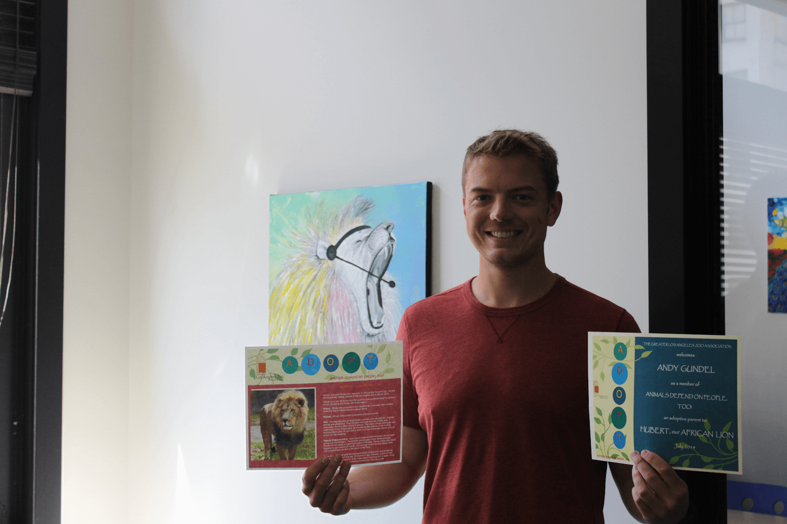
Anna laughs that seven years ago when she first came to the company and noticed our logo, it was one of the things that won her over. Now a product manager at MightyCall, she looks back at the significant road both she and our team have traveled since then.
“It’s not just the logo that has been evolving, it’s our service. Throughout all these years, we’ve never stopped and said, ‘OK, that’s good enough!’. We’re constantly giving our product, our interface, and our customer service a makeover. So this year, the lion got a makeover as well! It’s now as modern and dynamic as our service.”
Usability and simplicity drive our team: Nataly Manuylova, Senior UX Designer, MightyCall
As head of UX design at MightyCall, Nataly Manuylova was involved in updating our brand symbol. It was her task, among others, to make visual the philosophy that has become second nature to our team.

“The MightyCall lion has always reflected our goal to create a leading product in the market. In the process of redesign, we wanted to keep that victorious spirit but also give our company symbol more clear, dynamic features.”
As always with our designers, usability and minimalism were strong motivators behind their work.
“The new logo looks great in mobile app icons and underlines the essentials behind our brand. Ultimately, with all these changes, we wanted to create a symbol that’s composed yet energetic — like our business model itself.”
Final word
The MightyCall lion has come a long way since its early days. While our product, team, and customer service have matured strongly, we’ve remained as young, dynamic, and future-oriented as ever.
We also feel just as protective of our clients as a mighty lion. Because it’s our permanent goal to shield you from challenges of all kinds in the safari that is the business world! And from all of us, we extend great thanks to each one of you — our daily inspiration, our mighty customers!
